About the Project
Tilling.com.au were launching their new app, SmartFrame, and required a short, engaging video to explain and promote it.
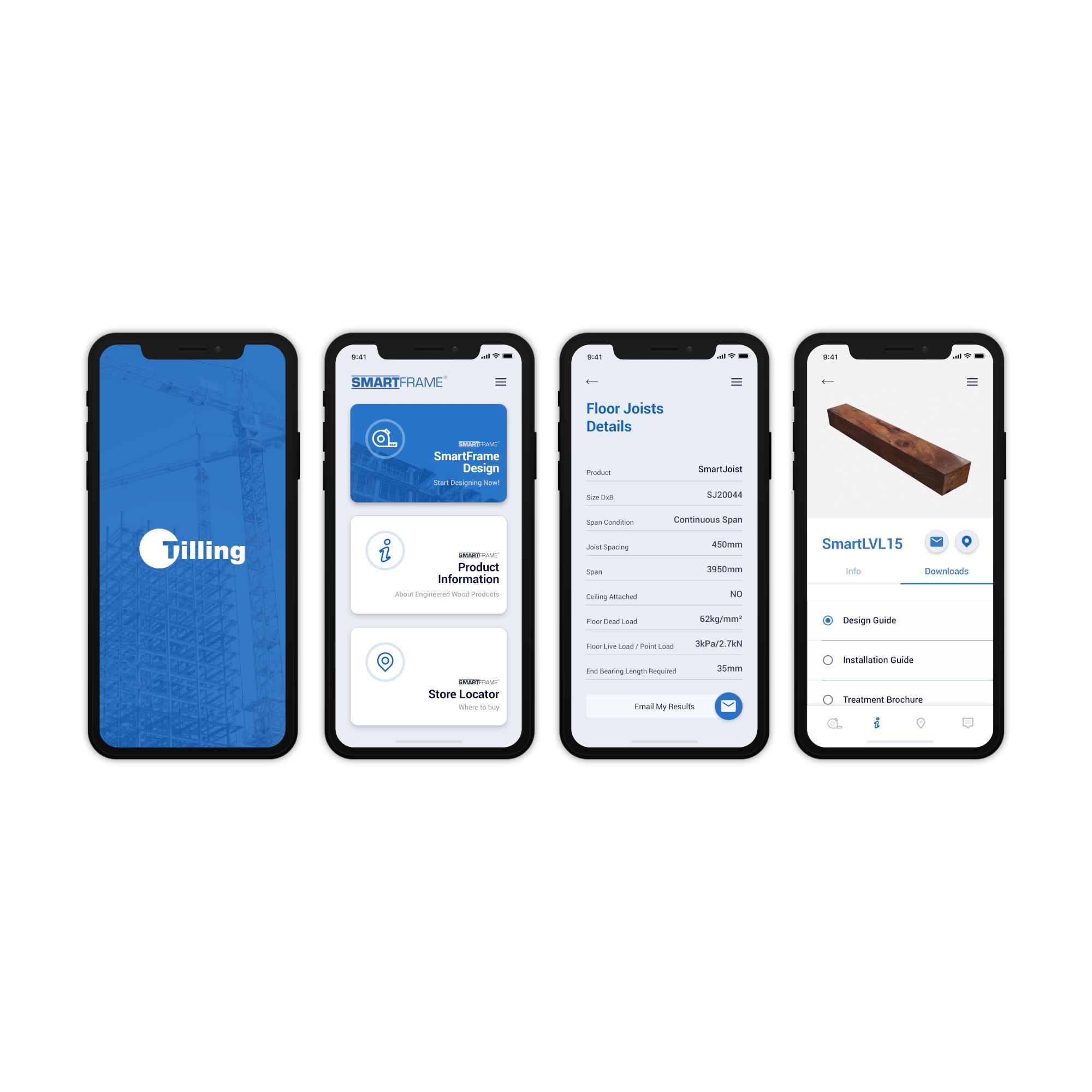
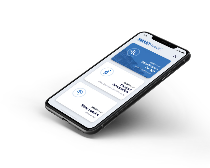
According to their website the app:
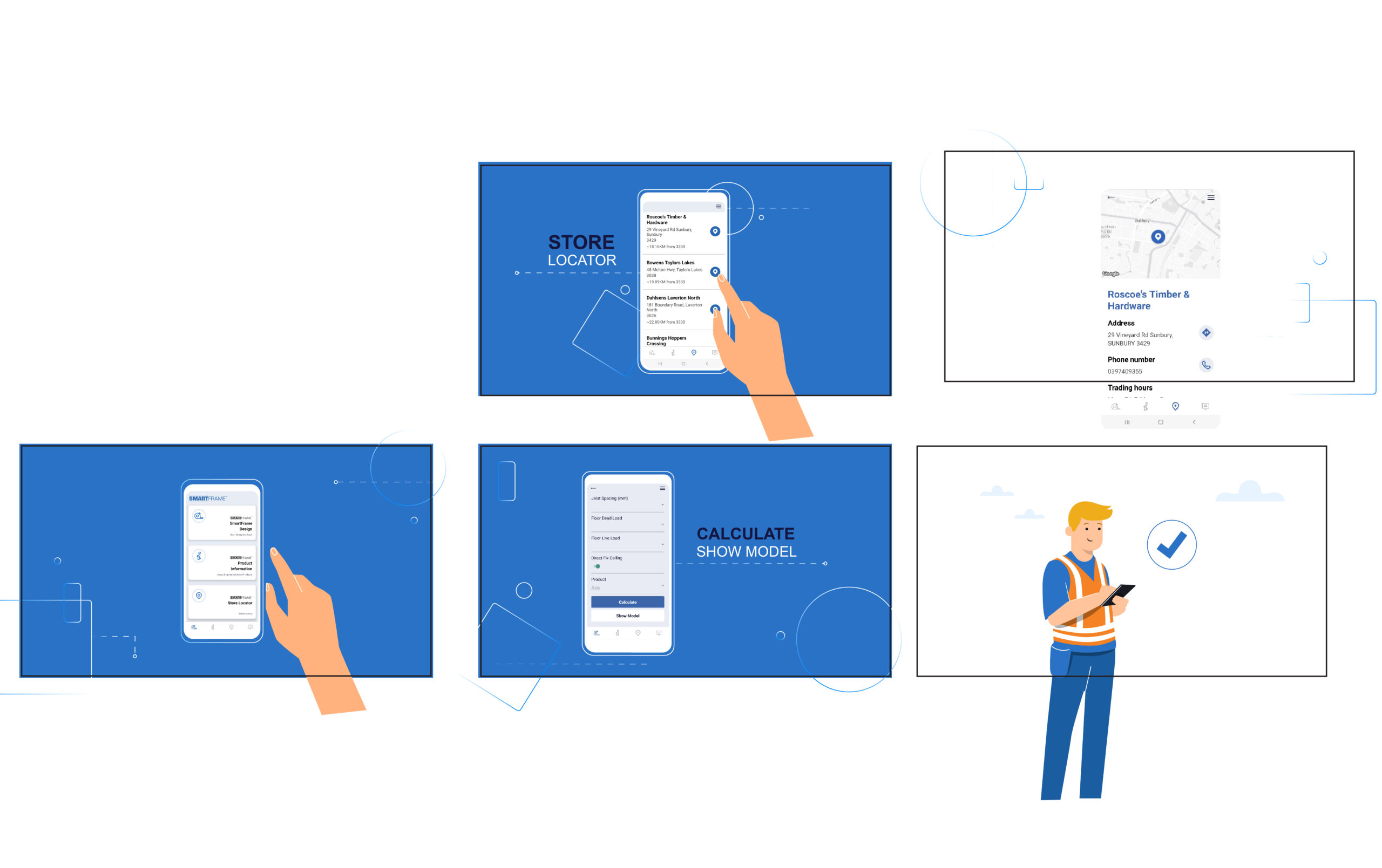
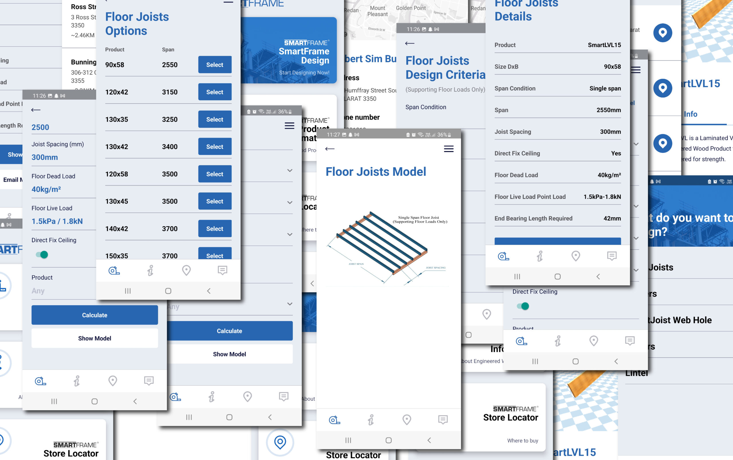
- Provides quick and convenient access to engineered verified span tables
- Confirms that your chosen timber application complies with engineered design guide specification
- Provides extensive product information by category
- Provides complete design and installation guides
- Allows easy exchange of information via email
- Locates the nearest supplier from wherever you are, using either GPS or postcode
- Sends a direct enquiry from the app to our support team
This project was handed to me while working with Visual Domain, Melbourne. I was tasked with producing style-frames, the final animation and sound design. I was provided with information about product, a script, a voice over and design guide.
The aesthetic was technical but friendly. It needed to appeal to builders and appear advanced but approachable.
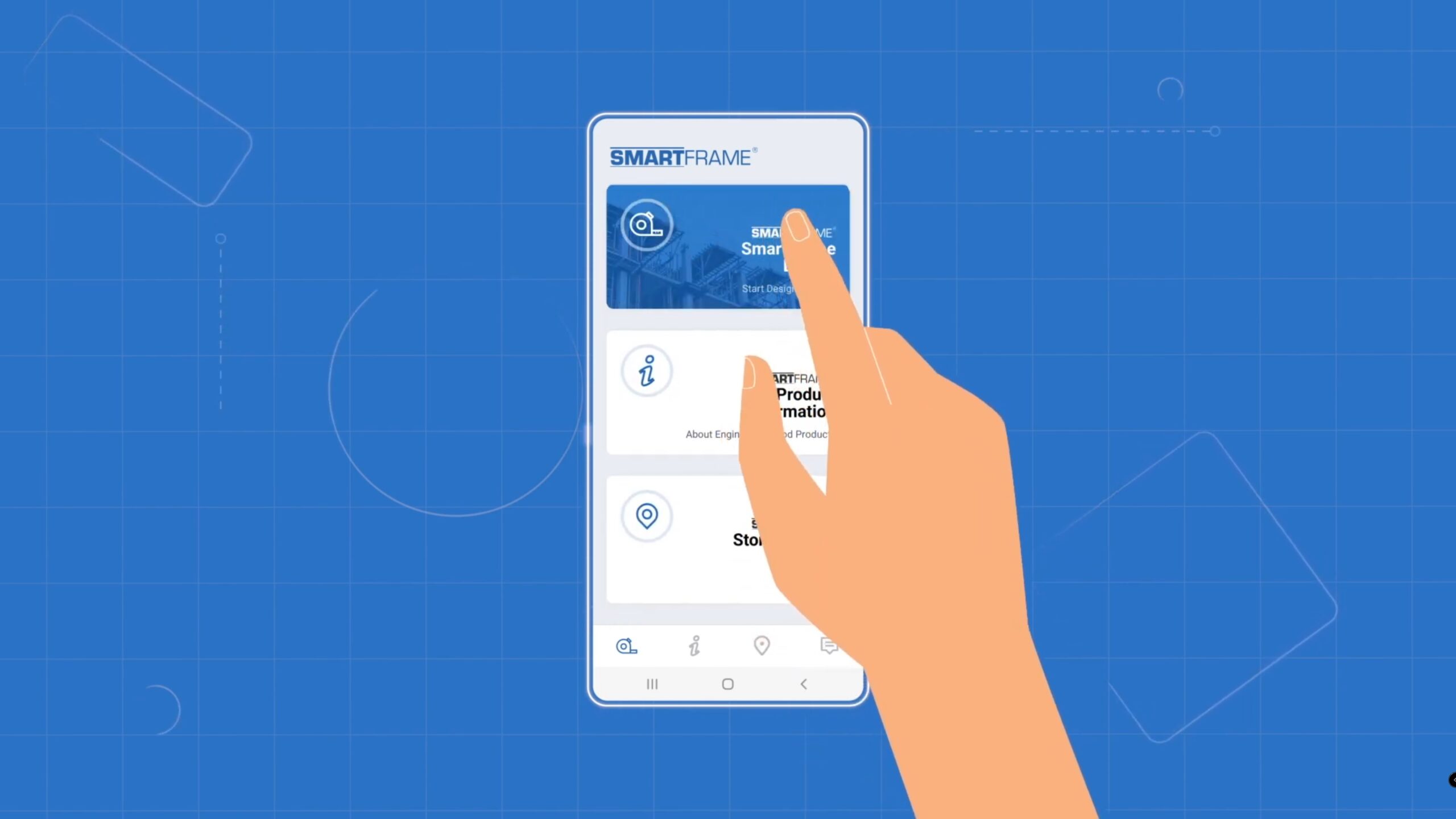
Developing the visual aesthetic to meet requirements was the first important task. To this end I merged two styles: simple cartoons and high-tech virtual world. I chose the blueprint background and added abstract shapes and a border to the phone screen to represent technical drawings while in a digital space. To these I added animated glows and fades to reinforce the ‘virtual’ aesthetic. These proved to cause pixelation issues which were eventually overcome with a third-party app (FXAA for after effects) and duplicated blurs. I wanted to steer away from a physical representation of a phone because I felt that that is overdone and unnecessary and also so that I could make a clearer distinction between the high-tech aesthetic and the friendly cartoon aesthetic.
The animations needed to be fairly slow so as not to enter the world of tech-demo. I gave them long eases, long anticipation movements, and no overshoot. This created an ‘easy’ feel to emphasis the usability of the app.
To create the app contents I downloaded the app and took dozens of screencaps and videos with I cut into pieces in illustrator.
For sound design I went full sci-fi but kept the sounds light and not overly loud – high-tech but approachable.
To off-set and compliment the sound design I used a slow, fun and thoughtful tune. This also reinforced the intention of the app to make life easier.